Five Famous Graphic Designers Everyone Should Know

Graphic design is the most essential component of visual communication in the modern world. It combines things like color theory, typography and layout to create something compelling and, hopefully, sell the audience an idea or product.
From global advertising campaigns to beautiful responsive websites, graphic designers craft experiences that captivate us and convey powerful messages.
Join us as we explore some of the most influential creatives who successfully made their mark in this dynamic industry.
Harry Beck
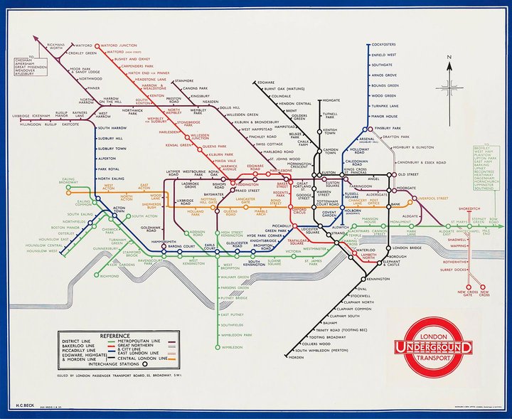
Though you might not think of it at first, maps are a brilliant example of functional design—they convey valuable information in an understandable format, helping millions of people reach their destinations every day.
Our first designer did just that by designing the famous London Underground map.
Harry Beck started off as an electrical draftsman with London Transport. Before he submitted his design, Londoners were using a map that focused heavily on the geographical accuracy of the stations, which made the tube frustratingly difficult to navigate.
Beck noticed this and used his electrical engineering background to create a map that used schematic diagram principles instead, replacing geographical accuracy with a more readable layout that emphasized clarity.
The publicity department initially rejected the map when he first submitted it in 1931, but it gained traction and grew in popularity over the next few years, thanks to its ease of use.
Since then, Beck’s map has been updated to include new lines, overground stations, and other relevant changes, but his influence remains visible to this day.
Beck’s design became a blueprint for other cities to create their own accessible and easy-to-use subway maps, including Berlin, New York City and Tokyo.
The influence of Beck’s work can be seen in the countless diagrammatic maps that are now ubiquitous in public transportation systems worldwide.
David Carson
David Carson is a legendary artist known for his nontraditional and experimental approach to graphic design.
Carson revolutionized the field with his unconventional style that often used typography, images and white space in a way that defied all popular design principles during that time.
He gained prominence during the 1990s while serving as the art director at Ray Gun magazine, which takes its place as one of the most influential music magazines in history, having collaborated with Sonic Youth, Björk, and David Bowie.
This is where Carson developed his highly distinct visual language.
Carson believed that communication and legibility did not have to mean the same thing, and so his covers often had inconsistent typography and random image placement. Despite the messiness and lack of order to his approach, his design style really encapsulated the 90s grunge era.
It was during this period that he also published his seminal book, “The End of Print”, which showcases his infamous work from many magazines, as well as advertisements for clients such as Pepsi and Sony.
Through his innovative contributions to the field, Carson has established himself as an iconic figure in the world of graphic design, with the moniker “the Godfather of Grunge”. He continues to inspire many designers to break free from traditional norms.
Milton Glaser
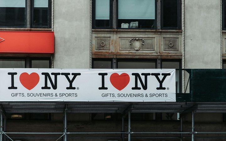
Milton Glaser is a legendary graphic designer known for creating the iconic “I ❤️ NY” logo in 1976.
Glaser famously drew the “I ❤️ NY” logo in the back of a taxi using a simple red crayon and some scrap paper.
This enduring symbol, like many other highlights of Glaser’s career, has millions of tourists excited to see New York State and instills a sense of pride in the locals who live there. Today, you can find the original drawing in the Museum of Modern Art in Manhattan.
Sticking with the New York theme, Glaser also co-founded New York Magazine, where he played a crucial role in shaping its visual identity.
Along with the brilliant illustrators at The New Yorker, he helped set a new standard for visual storytelling in the publishing industry.
Lauren Hom

Lauren Hom is a Detroit based graphic designer and artist known for her bold use of color and whimsical hand lettering.
She uses both digital and traditional mediums—though maybe you wouldn’t consider food as traditional or a medium. That’s right! You can find art made from flour, salt and even cookie dough in Hom’s portfolio.
The soft shapes, flowery designs, and bubbly typography in her work add a cheerful touch, making them irresistibly eye-catching and perfect for coffee shops and restaurants.
Hom’s own ‘Will Letter For Lunch’ is a personal project where she letters restaurant signs and menus in exchange for the food items she’s asked to write.
In terms of commercial work, she is incredibly sought after for her vibrant and inviting style, especially for marketing and advertising purposes.
It’s no wonder then that Hom’s playful approach to design has earned her collaborations with renowned brands like Google, Starbucks and Target.
Rob Janoff
![]()
Our last pick is Rob Janoff, a designer most known for his work on the famous Apple logo.
Prior to this, the company had been using an image of Isaac Newton sitting under an apple tree to represent its brand. However, Steve Jobs considered it too busy and complex for the emerging technology market.
This led Janoff to create a minimalistic yet striking symbol that is now universally recognized—the Apple logo.
Made public in 1977, the first official logo featured the rainbow-colored silhouette of an apple with a bite mark.
The old rainbow colors were there to represent the USP of the Apple II computer, as it was the only one on the market that could show images in color.
Though the designer originally included the bite so customers would not mistake the apple for a tomato or cherry, it ended up being a play on words with the computer term byte. This little coincidence only made the logo more memorable.
Since then, the logo has undergone various transformations—most notably losing the rainbow color scheme in favor of even more minimalism—but it remains deeply rooted in Janoff’s original vision even today.
How Design Can Make Your Shopify Invoices Stand Out
As you now know, graphic design plays a crucial role in the way people interact with your business and products.
This is especially the case with invoices, which aren’t exactly famous for being visually pleasing, giving you the opportunity to stand out by making yours a little different.
With Sufio’s range of professionally designed invoice templates for Shopify, you can choose a design that best suits your business.
We also understand a pre-designed template may not be enough for some brands, which is why we released Sufio’s new template editor. This feature allows users to take control and fully customize their invoice template.
Remember, a well-designed invoice doesn’t just convey a sense of professionalism and attention to detail, but also helps customers understand the value they are receiving from your business.
Try the 14-day free trial today and let us help you build a more recognizable brand for your store.
Professional invoices for Shopify stores
Let Sufio automatically create and send beautiful invoices for every order in your store.
Install Sufio - Automatic Invoices from the Shopify App Store